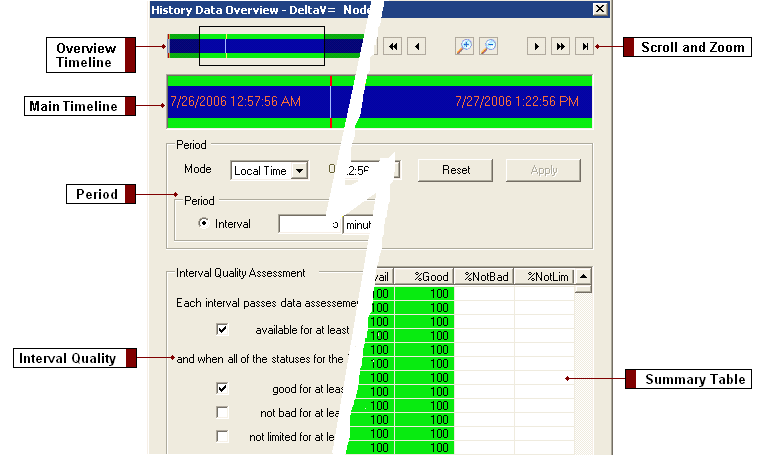
Use this dialog to assess the quality of the data for a selected period. This dialog enables you to view the data at various levels of detail and to adjust the period if desired.
For an example of how to use the Write Historical Data command to write a range of data in an Excel worksheet to a Continuous Historian database, refer to Writing Historical Data to a Continuous Historian Database in Books Online.
The dialog includes the following main areas:
Overview Timeline Shows all the data for a tag that is loaded in the database. This timeline enables you to select a portion of the period. Select and move the sides of the box to define the size of the period.
Scroll and Zoom Buttons Enable you to select a portion of the period. Use the buttons as follows:
Button |
Function |
|
|
Start the period at the earliest sample |
|
|
End the period at the latest sample |
|
|
Scroll a large step left |
| Scroll a small step left | |
| Zoom in (reduce the time period) | |
| Zoom out (expand the time period) | |
| Scroll a large step right | |
| Scroll a small step right |
Main Timeline Shows the current period and depicts the data quality and data availability by color.

The outer band color indicates data quality. The band color indicates values of Pass, Fail, or Unknown. The band color can also indicate Mixed quality values when a single pixel represents more than one interval and the intervals have different quality values.
The inner band color indicates data availability. The colors represent the following values: Hole, Non Hole, or Mixed. Unavailable data always shows up as a hole, regardless of the size of the period.
In order to evaluate the quality of the data detail, zoom into particular sections of the timeline. For example, you might zoom into an area with the Mixed color until you are able to see more precise quality and availability colors. The colors in the main time line may differ slightly from the colors in the overview timeline because of granularity differences. A mixed color in the overview may be shown in more detail in the main timeline.
You define the colors using the History Data Overview Options dialog (accessed from the Options button).
Period Provides field-based control of the period. Note that the software copies any changes you make here to the period of the calling dialog.
Mode Defines the mode for the start and end timestamps: Local Time or GMT. If GMT, you can specify an offset in hours and minutes. If local, the timestamp is treated as being in the client PC time zone.
Offset If GMT is selected as the mode, you can select a time offset in +/-hh:mm.
Date Range The timestamps of the start and end for the period.
Reset Restores all controls in the Period area of the dialog to their original values.
Apply Redraws the summary table and timeline using the values in the Period fields.
Interval The duration of each interval. Enter a positive number followed by a unit string, selected from the dropdown list. The dialog warns if the overall time period is not an exact multiple of this interval. This would lead to a final interval that is smaller than the others. If this situation is allowed to stand, the worksheet function extends the overall period by adjusting the To date.
Number of Intervals The number of intervals for which you want data. By configuring this value, the dialog automatically calculates the interval duration based on the currently specified start and end times. If the number is capped, the background color of the control turns from gray to yellow to indicate that capping has occurred.
For more information about the maximum boundaries of a worksheet, refer to Use the Worksheet Functions.
Interval Quality Assessment Enables you to define quality and availability percentages for the intervals. The values you select affect the presentation of data in summary table. For example, you can define those intervals where data is good 95% of the time by using the Pass background color.
Summary Table Displays the following information for each interval:
The total number of intervals that did not pass (Fail or Unknown) in each category are listed below the summary table under the appropriate column.
Additional Controls
Use Period Accepts the period you defined, closes the dialog and returns you to the Configure Calculated Data Function or Configure Interpolated Data Function dialog.
Options Enables you to show sample counts, show tooltips and change the colors used on the timelines and summary table.
Note that clearing the Show Sample Counts option can help performance by preventing DeltaV Reporter from reading data from the server. Period changes can cause a server read to collect sample counts if Show Sample Counts is checked and the period is changed in a way that alters the interval boundaries (which affects the value of interval counts). For example, if the period interval is 5 minutes, starting at 11:00pm on August 10, 2006, then changing the start time to 11:02pm changes the interval boundaries and causes a server read to get the interval counts. Changing the start time to 11:05pm does not cause a server read. Similarly, changing the interval duration to 2.5 minutes or 10 minutes (or to any value other than 5 minutes) also causes a server read. Changing it to 300 seconds does not.